An offline-first field app. +30% task completion for 1,800+ workers
As the only designer, I designed Biomás’ offline-first field app. Biomás measured 30% higher task completion and 50% less time finding donors’ homes.
Role
UX Lead
Team
PM, tech lead, 2 BAs, 3 devs, QA, data
Timeline
6 months
Platform
Android · Web
Status
In use, on Google Play
Tools
Figma, FigJam
01
Context & opportunity
Why it mattered
Part of Ferring Group, a global leader in reproductive health, since 2023. Biomás recruits urine donors (pregnant and menopausal women) and turns their donations into medicines that help women conceive.
Everything ran on paper. Visitors wrote donor details by hand and typed them into the web app later. Data got lost or duplicated, collectors couldn’t trust addresses, and nothing worked on the street, where there often wasn’t any signal.
Who it’s forShow 4 items
Visitors (500+)
Find and register donors on the street, often without signal.
Collectors (1,340+)
Pick up donations from donors’ homes and plan their daily routes.
Contact center agents
Manage donors from the web app.
Donors
Receive real-time notifications when a collector is on the way.
02
Problem & discovery
What we needed to understand
How it worked before
Donor details on paper
Typed into the web app later
Collector looks for the address
Donation collected
Every hand-off was a chance to lose or duplicate a donor’s data.
What kept coming back
No signal on the street.
Worried about phone theft while typing.
Duplicate donors and addresses.
Write it on paper, type it again later.
03
Strategy & direction
What I decided and why
Decision 1Shipped
Offline-first, native Android
The tension
Visitors work on the street, often without signal, on older phones.
Options I ruled out
Making the existing web app work on mobile. It needed a connection at every step, which is why the field team still used paper.
What I chose
A native Android app that saves everything on the device and syncs when there’s a connection.
Trade-off
Sync to handle, and a separate codebase from the web app.
Result
Visitors register donors on the spot, even with no signal.
Decision 2Shipped
A shorter form, with drafts
The tension
Registering a donor took time, and agents typing on the street worried about their phone being stolen.
Options I ruled out
One long form in a single go. Simpler to build, but it kept agents on the street, phone in hand, until the very last field.
What I chose
Reorder and trim the form, put personal data first, and let any registration be saved as a draft to finish later.
Trade-off
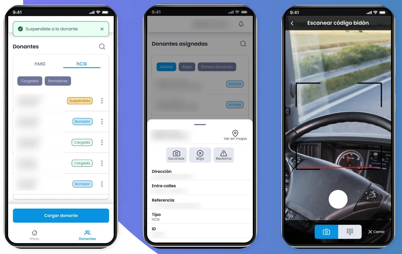
Drafts need a clear status everywhere, so every list shows Draft or Loaded.
Result
Refined through usability testing with visitors.
Decision 3Shipped
Catch duplicates at the source
The tension
Duplicated donors and confusing addresses sent collectors to the wrong homes.
Options I ruled out
Cleaning duplicates later in the office. The errors stayed in the field until someone noticed.
What I chose
Alert the visitor when a donor may already exist, and pin each home with GPS, with a manual adjustment on the map.
Trade-off
One more step in registration when a match is found.
Result
Biomás measured 50% less time finding donors’ homes.
Decision 4Shipped
QR codes to link each donation
The tension
Every container has to be tied to the right donor.
Options I ruled out
Typing IDs by hand: slow, and another source of errors.
What I chose
Collectors scan a QR code on the container to associate the sample with the donor.
Trade-off
It depends on labels being readable in the field.
04
Design & validation
How the solution evolved
A native Android app (Kotlin) for the field and an updated web app (Vue.js) for the office, on one shared API. Visitors register, edit and deregister donors, even offline, with photos and GPS location. Collectors get a route sheet, a map and QR scanning. Everyone gets real-time notifications.
Behind both, a new design system adapted from the web app’s style: colour, type, components and statuses, with larger touch targets and better contrast.
Design system
Android app
Web app
Shared API
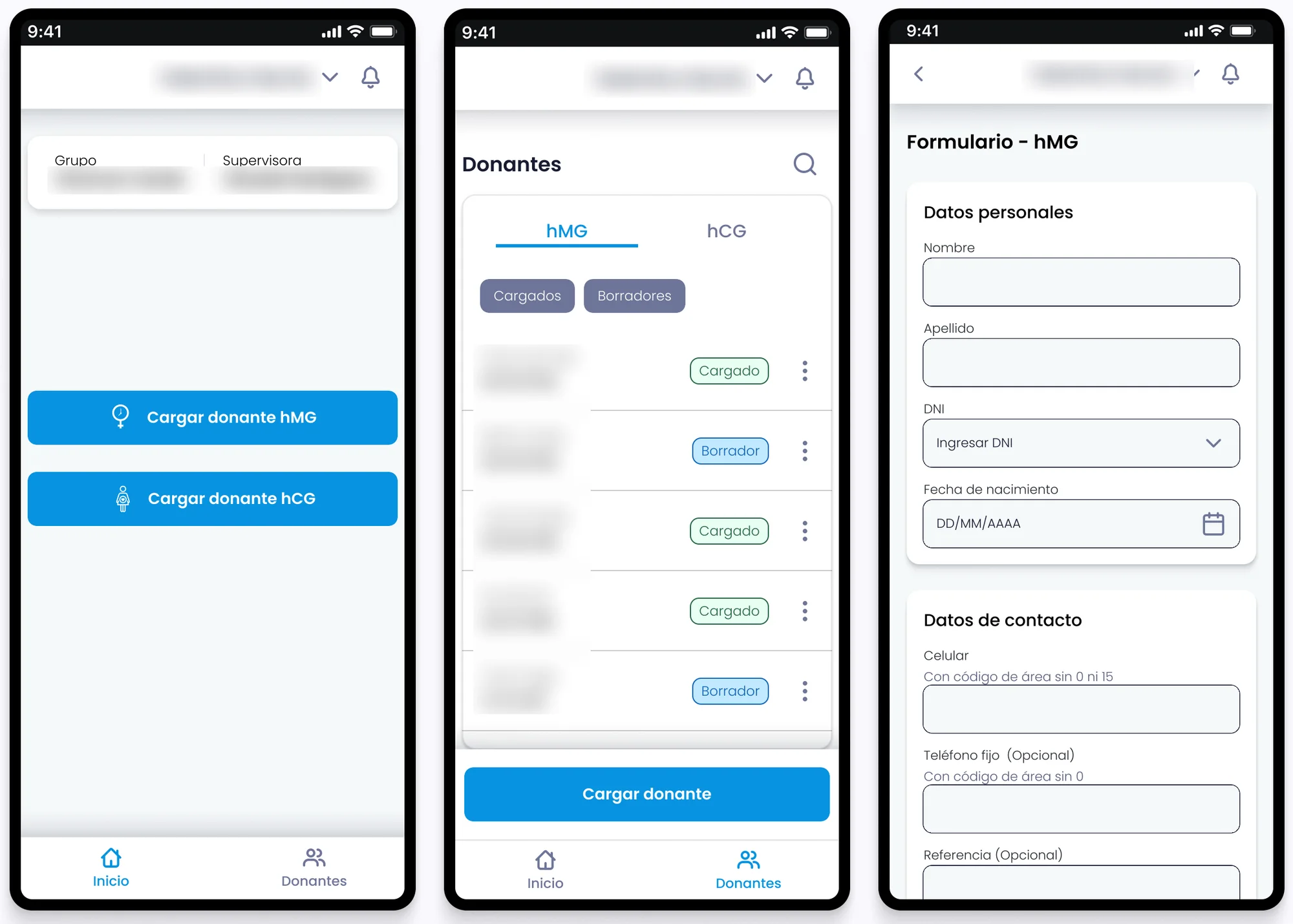
123
Quick access: one tap from home to register each donor type.
Drafts save a half-finished registration, so agents can stop at any point and finish later.
The form was reordered and trimmed: personal data first, then contact and address.
How each decision was testedShow 4 items
Offline-first, native AndroidShipped
Connectivity came up in interviews and field observation with both visitors and collectors; the prototype was tested with them.
A shorter form, with draftsShipped
Pain points from the interviews, refined through usability testing with visitors.
Catch duplicates at the sourceShipped
Came from the collector interviews and was mapped as its own branch in the user flows.
QR codes to link each donationShipped
Defined with collectors and the tech team, and tested in the prototype.
05
Execution & collaboration
How it got built
What I owned
Two months of discovery (interviews, field observation and workshops), flows, information architecture, a new design system, prototypes tested with visitors and collectors, and the design of the Android and web apps.
What others did
An 11-person team built it: PM, tech lead, two BAs, three developers, QA and data engineering.
Setup
UX Lead · the only designer · 6 months
Design system
A new design system, adapted from the web app’s style to the field: bigger touch targets, clearer contrast, and states everyone reads the same way.
What it’s made ofShow 4 items
Navigation per role
Visitors get Home, Pre-loads and Donors; collectors get Route sheet, Map and News.
Donor statuses
Active, Inactive, Suspended and Draft, shared by the app and the web.
Semantic colour
Error, warning, info and success, each with its own background for alerts.
Components
Buttons, text fields with helper and error states, radio buttons, top and bottom app bars, icons.
Edge cases, designed up frontShow 6 items
No signal
Registrations are saved on the device and sync when there’s a connection.
A registration gets interrupted
Drafts keep the half-finished form; every list shows Draft or Loaded.
The donor may already exist
A duplicate alert before saving.
The pin lands in the wrong place
Visitors can move the location on the map by hand, and the marker stays where they put it.
A donor’s status changes
Active, Suspended and Inactive statuses, with a reason for every deregistration.
Address changes and complaints
Handled in the app, with notifications to the visitors and collectors affected.
06
Impact & learnings
What changed and what comes next
+30%+30%
Task completion
Measured by Biomás.
−50%−50%
Donor-location search time
Measured by Biomás.
1,800+1,800+
Field workers
500+ visitors and 1,340+ collectors, using it today.
Impact by dimension
User
+30% task completion, measured by Biomás.
Business
1,800+ field workers use it today: 500+ visitors and 1,340+ collectors.
Operational
−50% time finding donors’ homes, measured by Biomás. Duplicates are flagged at registration.
Before and after
What changed
Before
After
Registering a donor
On paper, retyped later, if at all
In the app, even offline, with drafts
Duplicate donors
Found later, in the office
Flagged at registration
Linking a donation
IDs by hand
A QR scan on the container
Knowing what’s ready
No timely information for collectors
Real-time notifications
The app is still in use today by visitors and collectors.
In field work, the hardest constraints aren’t on the screen: signal, safety and time on the street shaped every decision.
In field work, the hardest constraints aren’t on the screen. Signal, safety and time on the street shaped every decision more than any visual detail, and going out with the people doing the job helped me see them.